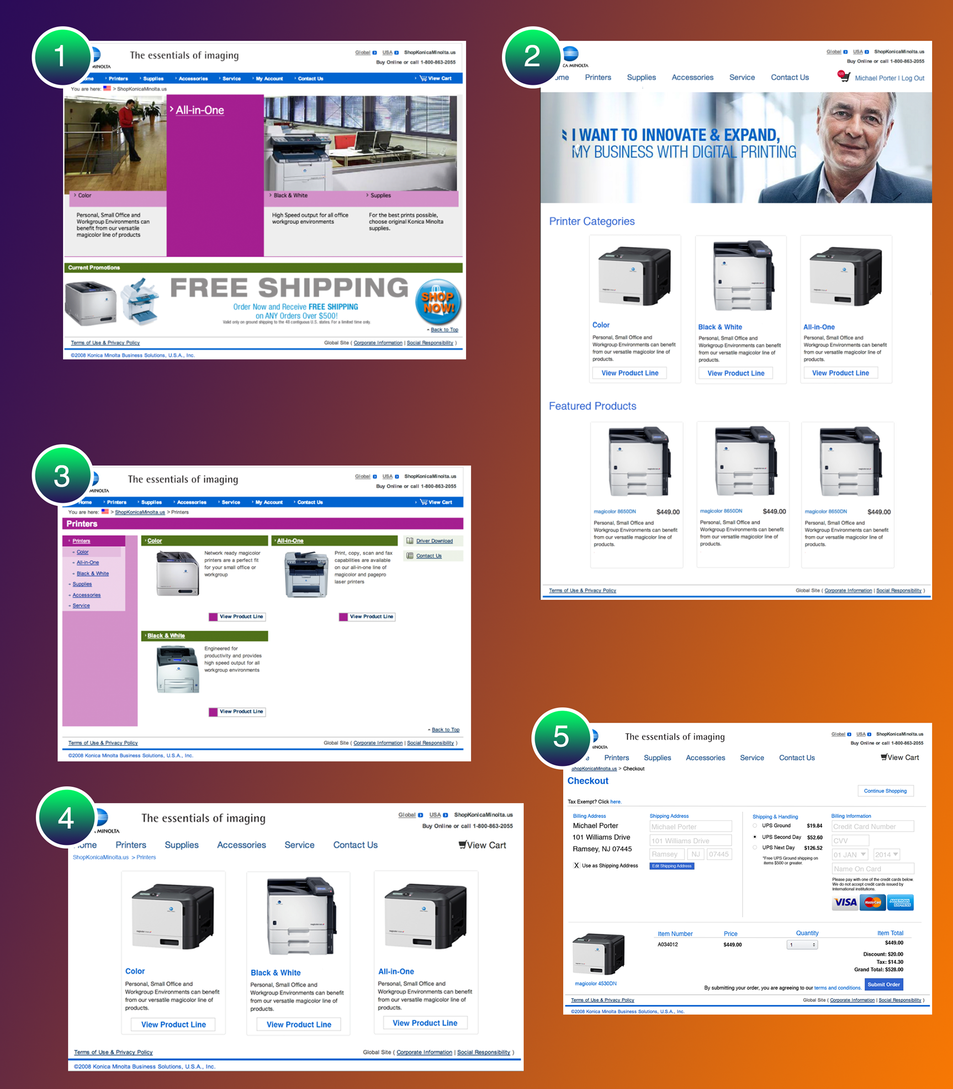
This was a quick project to refresh Konica Minolta's shop site for their small multi-function printers. As was usually the case, I had to deal with a legacy framework upon which the site was built, so I was limited structurally to what was already there.
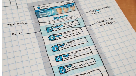
Image Key:
1) Navigation was primarily Flash, which is no longer supported by mobile browsers (Adobe has ceased support for Android) and not automatically supported on some modern browsers. The page was terribly out of date, in terms of both content and design, and not in alignment with the current branding guidelines. Overall, the interface was not intuitive.
2) The site had all flash removed and the look was updated to bring the site in line with most modern websites. I brought product categories and featured products up front and moved the "Account" navigation over to the right with the Shopping Cart.
3) This is the original Printer page. Notice the redundant side-navigation and inexplicable color combinations.
4) The three categories are more visibly prominent and the side-navigation has been removed. Breadcrumbs were added to assist in user navigation.
5) Checkout was previously a never-ending vertically stacked mess. All forms on the site were redesigned to use as few fields as possible in an effort to speed users through the sales funnel. This checkout gathers as little info as possible from the user and includes the purchase totals so that the user can complete the order without having to go "Back" to view their order.