Everything begins with a sketch; actually, everything begins with stakeholder buy-in when working within an Enterprise organization.
KMBS needed to completely rebuild their existing public-facing website; this meant we had a chance to completely reorganize the site architecture and taxonomy to bring it up to date, but to also make sure it would be compatible with the newest version of the IBM WebSphere CMS.. The new approach favored heavy photographic assets and visual design.
Once the initial draft of the sitemap was complete, I began with sketching and wire framing. Beyond the initial basic wireframes, everything was done according to development sprints led by the third party developer contracted for the project. We would often go from initial sketch to realized design in a day. This was very fast for an organization that had had no exposure to a UX workflow or agile development.
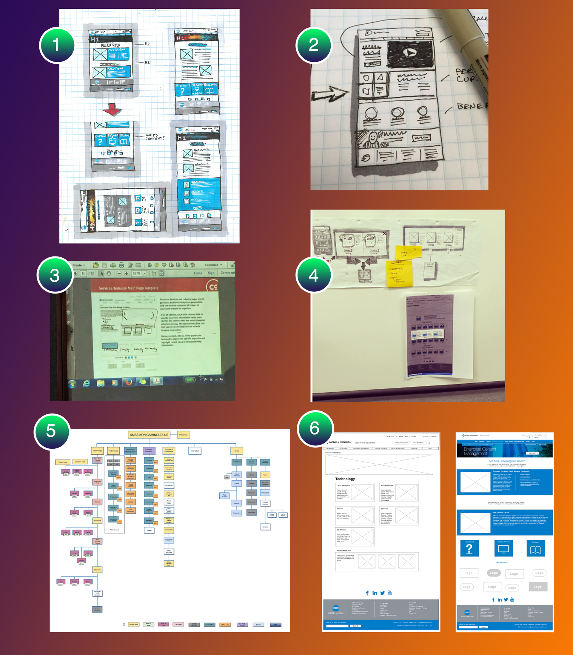
Image Key:
1) Product Page sketches optimized for the marketing funnel. Doing sketches with color often helped the managers that I worked with to visualize what the final design would look like without me having to get them in front of a screen.
2) Persona-based content was a very big feature desired by executive management. This sketch was my way of blocking out components that could be interchangeable with four persona types we were being asked to design for.
3) This image shows a projection of a wireframe onto a white board where we were designing for our IT Services branch who flew in from San Francisco to hammer out the details.
4) An example of my problem-solving process. We were given a requirement for a product comparison feature on our product pages. Rather than redirect to another page I opted for a modal that displayed a total of three products (I was limited by what the CMS could display). The user could return to their search page, or continue on to different product pages.
5) Our collaborative and ever-evolving site map. Color coded according to page template.
6) An example of how wire-framing progressed during the project. Wires were initially bare-bones, but as the visual designs came together more elements were added in order to expedite the front-end development effort.
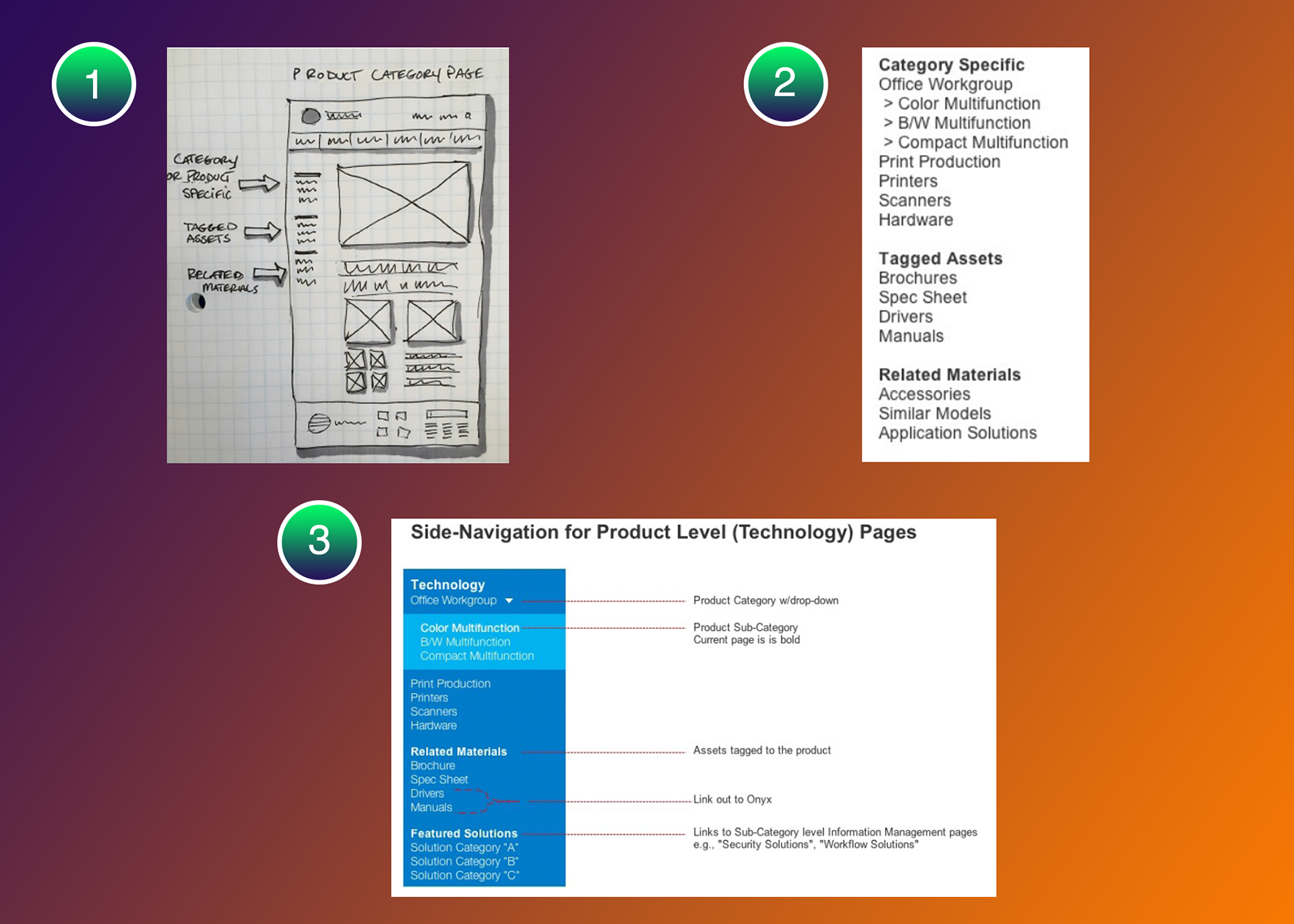
One issue you have to deal with when designing for a large corporate project such as this is mid-development changes requested by high-ranking stakeholders (AKA Scope-Creep). In this case, even though we had accounted for navigation and access to marketing assets in our product pages, there were concerns that users would not have easy enough access to said materials.
The above images show my process of addressing the imaginary problem. Management wanted to be able to navigate to main categories and sub-categories in addition to accessing assets that were tagged in the CMS, and then be able to feature software solutions tagged to certain hardware. One compromise was that the side-navigation would not be accessible on mobile screens, so I added drop-down functionality to navigate product categories. The menu would float with the user as they scrolled.
Image Key:
1) My initial sketch produced on the spot with our management and visual designers.
2) A later refinement once the assets were defined.
3) Final annotated design sent to our developers.
We went live with this design, but shortly after go-live I was able to show via heat mapping that the feature was not being used. To back up my assertion, I ran user tests that showed that the side-navigation was being completely ignored by users and should be removed. At this point everyone could agree anecdotally that the floating navigation was annoying at best and we were able to remove the "feature".
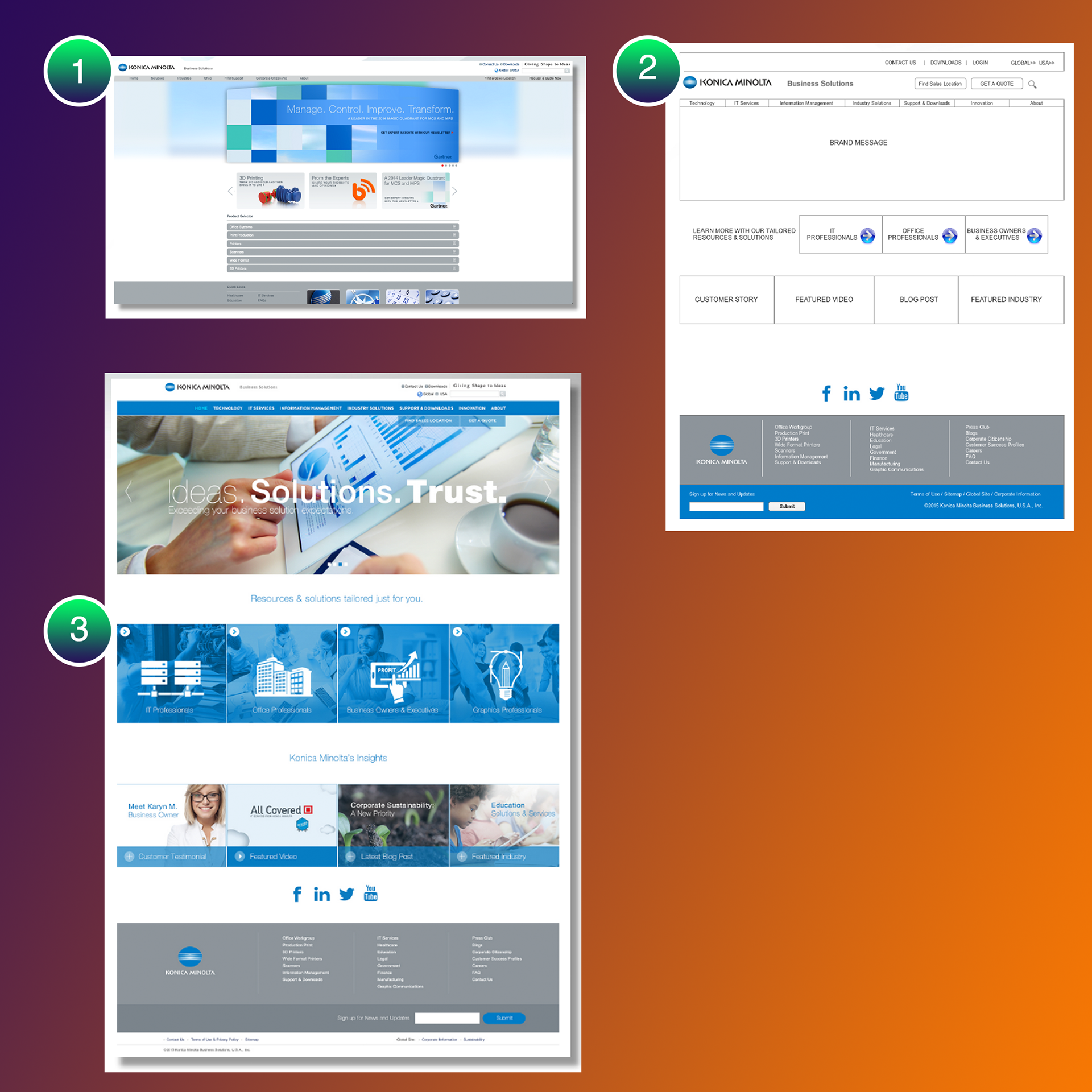
These images serve to show the progress of the project from a visually depressing fixed width web site with an unintuitive navigation to fully responsive website that addressed business needs balanced with the needs of our users.
Image Key:
1) The initial homepage designed in 2012. The navigation scheme was strange, and content was hidden from users.
2) Wireframe showing the new approach of content-based marketing and streamlined navigation.
3) The final design featuring bold photos and illustrations and large hero image. I tried to avoid the use of a carousel, as there's no data showing them to be effective, but I was voted down. Can't win them all! But in all seriousness, this project was a major learning experience for me, being the largest project I had ever worked on across multiple silos in a large organization with a large number of stakeholders.